


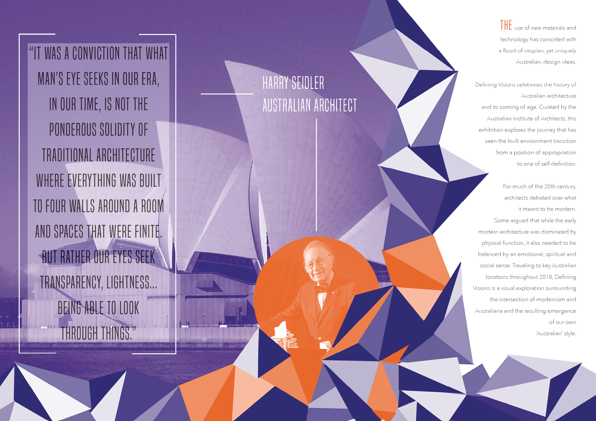

The brief given was to create a brochure for Defining Visions exhibitions about Australian architecture whilst only using two Pantone colours and have it ready for print. For the colour palette, I chose a bright orange to compliment a dark purple. The images were supplied and I monochromed the image to be purple or orange. I designed a triangle geometric patterned around them to cooperate the theme of architecture. The pattern is different tones of the two Pantone colours, this give it more depth. The typeface for the heading is a thin, long san serif that looks modern, as the exhibition is about modern architecture. The body text’s typeface is a simple fine san serif that is easily readable. I designed half the body text to be on the inner panel so the reader opens it straight away and gains the information. I did this to also break up the text so it’s not so heavy on for the reader and has plenty of room for design on both sides of the brochure.